Landing Page Examples: 8 Structures That Convert, and How to Build Yours
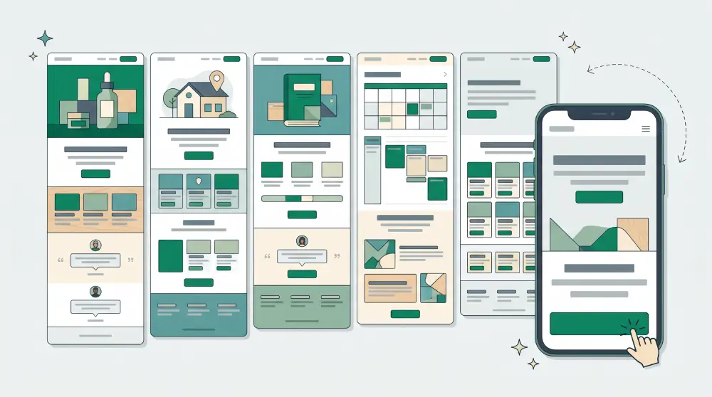
Searches for landing page examples have broken out in several directions this month: sales landing pages, mobile landing pages, real estate, ebooks. At the same time, searches for Leadpages and Carrd alternatives have shot up. People want to see what works, and they want somewhere better to build it.
Most people looking at examples aren't trying to copy one. They want to know which sections a landing page needs and in what order. So instead of screenshots, here are the structures behind the examples. If you're not sure what a landing page is yet, start with what a landing page is and when you need one.
The formula behind almost every example
- A headline that names the outcome, not the product
- One main button, visible without scrolling
- The problem your reader has, in their words
- The solution: what you offer and how it works
- Proof: testimonials, real photos, numbers, logos
- The offer: price, what's included, a deadline only if there really is one
- FAQ that answers objections
- The same button, repeated at the end
Every example below is a variation on that formula.
1. Sales landing page
For a single product or offer, sold directly on the page. Lead with the result ("Sleep through the night in a week"), then a photo or short video of the product in use. The sections that decide the sale are the comparison (with and without), the guarantee, and testimonials with names and faces. Put the price near the button, not hidden at the bottom.
2. Mobile landing page
"Mobile landing page examples" is one of the fastest-rising searches, because most traffic from ads, email and social now arrives on a phone. Good mobile pages keep the headline to two lines, put the button within the first screen, use a sticky button that stays visible while scrolling, and keep forms to as few fields as possible with the right keyboard for each (numbers for phone, email for email).
3. Real estate landing page
One property or one development per page. A large photo gallery, the floor plan, starting price, a map with what's nearby, and a monthly payment estimate, because that's the buyer's first question. The button books a viewing rather than asking people to "contact us".
4. Ebook or lead magnet landing page
Show the cover, then three to five bullet points on what the reader will learn. A short excerpt or table of contents builds trust. Ask only for the email address, and say what happens next ("We'll send it to your inbox in a minute").
5. Service landing page
For trades, agencies and consultants. Service buyers need to trust you before they get in touch, so show your area, past work with photos, a three or four step process, and a price range. The button opens a short quote form: name, contact, what they need.
6. Course or webinar landing page
Say what people will be able to do when they finish, then list the modules or agenda. Show the teacher with a photo and credentials. For webinars, date, time and time zone belong on the first screen.
7. Seasonal promotion landing page
For Black Friday, holiday or end-of-season sales, build a separate page instead of reworking your homepage. Discount and deadline in the headline, the products included, short terms. When it ends, switch the page off without touching the main site.
8. Ad landing page
One ad, one landing page. The headline should echo the line people clicked. If the ad promises a free consultation, the page should be about the free consultation, not your company history. This "message match" is one of the cheapest ways to lower cost per lead.
Common mistakes in landing page examples you shouldn't copy
- Navigation menus that lead visitors away from the one action you want
- Two or three competing buttons with different goals
- Stock photos that look too perfect to be real
- Forms asking for information you don't need yet
- Pages that look great on desktop and break on phones
Looking for a Leadpages or Carrd alternative?
Leadpages is built for marketers running campaigns; Carrd is loved for simple one-page sites. People start looking elsewhere when they need both landing pages and a full website in one place, want to collect and follow up on leads without extra tools, or want AI to write the first draft. Whatever you choose, check that it lets you set the SEO title and share image per page, sends form entries somewhere you can actually work them, and lets you use your own domain.
How to build your own
- Pick one goal. Buy, sign up or request a quote. Just one.
- Write the headline and button first. If those two aren't clear, the rest will be fuzzy too.
- Start from a template or let AI draft it. Templates give you structure; AI gives you first-draft copy that's already about your offer.
- Replace every photo with a real one.
- Set the SEO title and share image. Landing pages get shared in chats, and how the link preview looks decides whether people click.
- Test it on your phone, then send it to a friend and watch them use it.
Building landing pages on PageHub
On PageHub you can start from the landing page template gallery or write a prompt and let AI build the whole page, copy included. Edit it in the visual editor, add a form whose entries land on a Leads board you can move through stages, and preview how the page looks in Google and when shared before you publish. Landing pages live alongside your full website on the same account.