
معاينة القالب
فتح كامل ↗
Toko Online
Gadget Store
«استخدم» يفتح لوحة PageHub لتبدأ من هذا القالب.
- الفئة
- Toko Online
- النوع
- موقع متعدد الصفحات
- عدد الصفحات
- 4
- متجر إلكتروني
- مشمول
- نُشر في
- 1 سبتمبر 2026
- الاستخدام
- 2 مرة
Gadget Store is a full online shop for a phone and laptop retailer: four pages plus catalogue, product, cart, checkout and a journal. Its subject is the question that decides every gadget purchase in this market — official warranty or grey import — and it answers it in a table rather than a slogan. Two mechanisms run: a comparison tool and a warranty triage.
Pages included
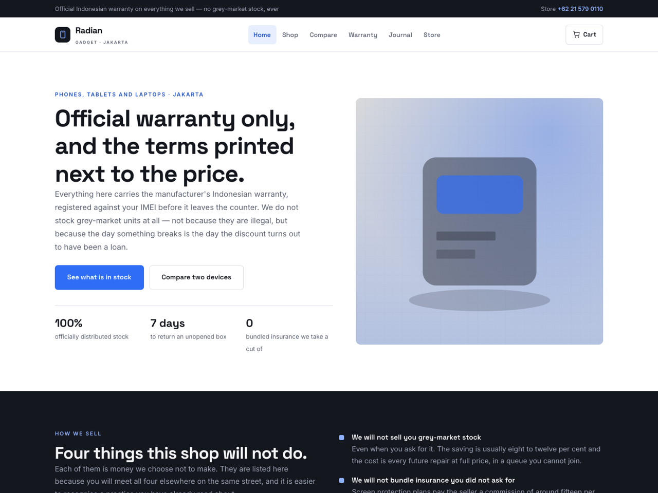
Home — hero on official stock only, a dark band of four things the shop refuses to do (grey stock, bundled insurance, storage upsells, pretending last year's model is obsolete), a live product strip filled from the catalogue, a six-row official-versus-grey table that concedes the row where grey wins, a comparison teaser, four counter services charged at nothing, and three customers including one talked out of buying.
Compare — the comparison tool: tick two devices (three at most; the rest disable themselves rather than being ignored) and eleven specifications land side by side, with only the differing rows marked and a count of how many are simply identical. Every value lives once, as a data- attribute on the device's own checkbox. Then three specification rows that mislead almost everybody — megapixels, charging watts, refresh rate — and three real pairs with the shop's own recommendation, two of which point at the cheaper phone.
Warranty — the triage: pick the fault and get a verdict (covered, partly, not covered), who handles it, what it costs and how long. Three of the six answers are “not covered”, which is the reason it is useful. Then the terms in one table including a row for devices bought elsewhere, an in/voids-it pair where the second list is the one to read, a four-step claim process and a claim form.
Store — address, parking, an enquiry form that asks for a budget and offers “tell me what makes sense”, opening hours beside counter-service cut-offs and the honest busiest hours, three ways to arrive, and what will and will not happen when you walk in.
Shop, product, cart, checkout — catalogue with category chips, product page with working gallery and a link into the comparison, cart that explains what collection includes and delivery does not, and a checkout that says plainly nothing is set aside until payment lands.
Journal — four long posts: last year's flagship versus a new budget phone, how much storage you need in photographs rather than gigabytes, genuine versus third-party screen repair, and why the shop refuses grey stock — including the case for buying one anyway.
Design and style. Graphite and blue on cool grey, Space Grotesk over Inter, rounded cards, a solid sticky header with a phone number in the strip above. The shared script carries the menu, the comparison, the triage, the product gallery and accordions — all vanilla and null-guarded, since it runs on every page.
Before you publish. Every specification lives once, in the data- attributes on each device's checkbox — the table, the difference marking and the count all derive from them, so there is one place to edit. The prices there are also in the catalogue and in the pairs table: change all three. The warranty answers are promises with money attached, so verify each against what your service centres actually do before publishing — a triage that says “covered” where yours says otherwise will be quoted back to you at the counter. Same for the grey-market comparison: those repair prices date quickly. Forms use named inputs with no action attribute, so PageHub attaches the handler on publish; sample products and articles are for the preview only and never reach your catalogue.
Best suited to phone and computer shops, camera and audio retailers, appliance and electronics dealers, and any shop selling technical goods where the buyer's real question is not which is better but which of these differences will I ever notice.
Pages included
Home — hero on official stock only, a dark band of four things the shop refuses to do (grey stock, bundled insurance, storage upsells, pretending last year's model is obsolete), a live product strip filled from the catalogue, a six-row official-versus-grey table that concedes the row where grey wins, a comparison teaser, four counter services charged at nothing, and three customers including one talked out of buying.
Compare — the comparison tool: tick two devices (three at most; the rest disable themselves rather than being ignored) and eleven specifications land side by side, with only the differing rows marked and a count of how many are simply identical. Every value lives once, as a data- attribute on the device's own checkbox. Then three specification rows that mislead almost everybody — megapixels, charging watts, refresh rate — and three real pairs with the shop's own recommendation, two of which point at the cheaper phone.
Warranty — the triage: pick the fault and get a verdict (covered, partly, not covered), who handles it, what it costs and how long. Three of the six answers are “not covered”, which is the reason it is useful. Then the terms in one table including a row for devices bought elsewhere, an in/voids-it pair where the second list is the one to read, a four-step claim process and a claim form.
Store — address, parking, an enquiry form that asks for a budget and offers “tell me what makes sense”, opening hours beside counter-service cut-offs and the honest busiest hours, three ways to arrive, and what will and will not happen when you walk in.
Shop, product, cart, checkout — catalogue with category chips, product page with working gallery and a link into the comparison, cart that explains what collection includes and delivery does not, and a checkout that says plainly nothing is set aside until payment lands.
Journal — four long posts: last year's flagship versus a new budget phone, how much storage you need in photographs rather than gigabytes, genuine versus third-party screen repair, and why the shop refuses grey stock — including the case for buying one anyway.
Design and style. Graphite and blue on cool grey, Space Grotesk over Inter, rounded cards, a solid sticky header with a phone number in the strip above. The shared script carries the menu, the comparison, the triage, the product gallery and accordions — all vanilla and null-guarded, since it runs on every page.
Before you publish. Every specification lives once, in the data- attributes on each device's checkbox — the table, the difference marking and the count all derive from them, so there is one place to edit. The prices there are also in the catalogue and in the pairs table: change all three. The warranty answers are promises with money attached, so verify each against what your service centres actually do before publishing — a triage that says “covered” where yours says otherwise will be quoted back to you at the counter. Same for the grey-market comparison: those repair prices date quickly. Forms use named inputs with no action attribute, so PageHub attaches the handler on publish; sample products and articles are for the preview only and never reach your catalogue.
Best suited to phone and computer shops, camera and audio retailers, appliance and electronics dealers, and any shop selling technical goods where the buyer's real question is not which is better but which of these differences will I ever notice.
لا توجد تقييمات بعد. التقييمات تأتي ممن استخدموا هذا القالب فعلًا.