
Pratonton templat
Buka penuh ↗
Umum
App Showcase
"Guna" membuka papan pemuka PageHub supaya anda boleh bermula daripada templat ini.
- Kategori
- Umum
- Jenis
- Halaman pendaratan
- Diterbitkan
- 1 September 2026
- Digunakan
- Tidak pernah digunakan
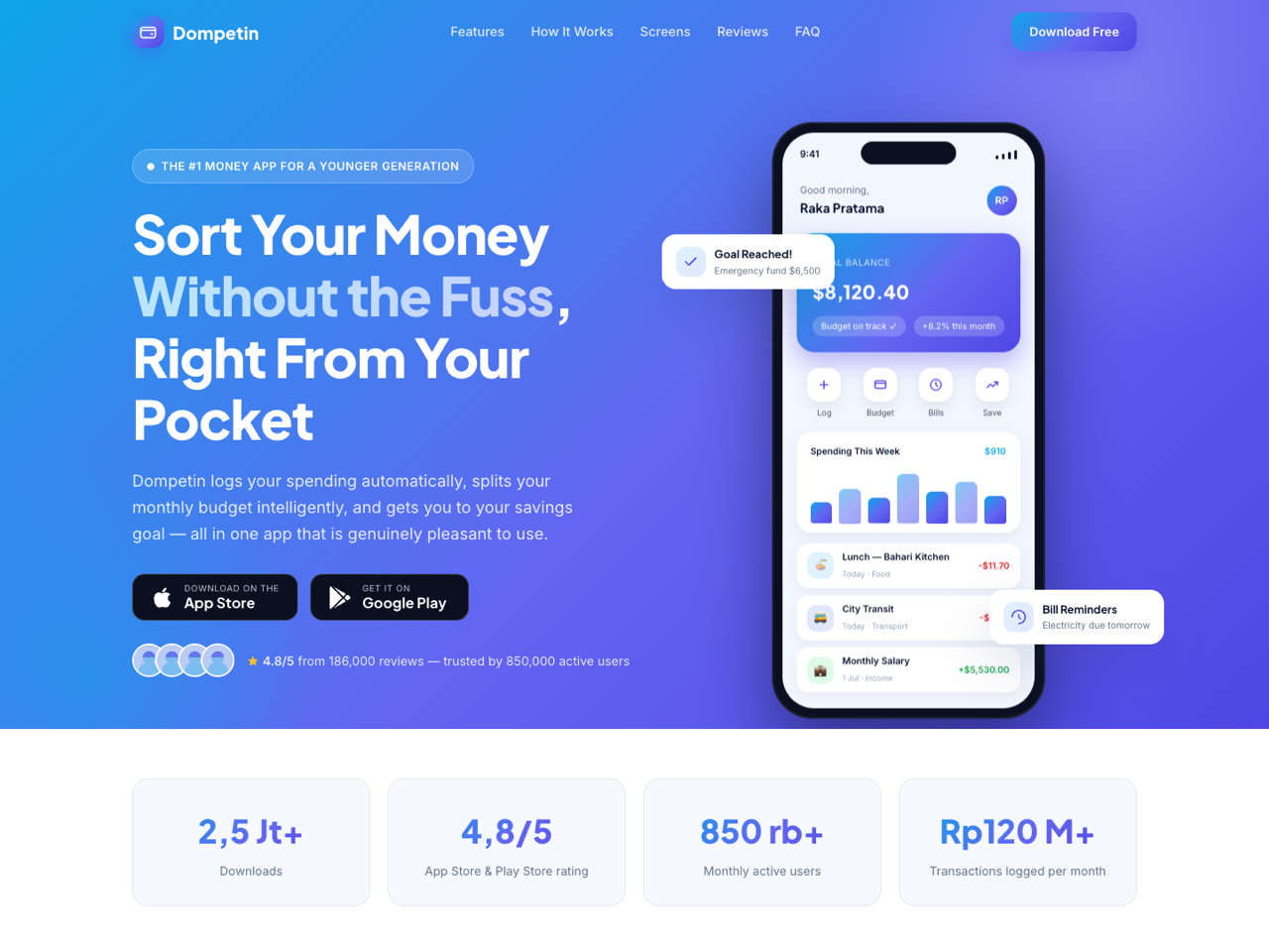
App Showcase is a premium landing page for a mobile app, built around a phone mockup that does the selling. A sky-blue to indigo gradient carries the whole page, and the hero shows a real interface — balance, spending chart, transaction list, floating goal and reminder cards — rather than a generic device photo.
Sections, in order
Sticky navbar with a mobile drawer and a download button.
Hero — rating pill, headline with a highlighted phrase, subhead, both store badges (App Store and Google Play), a review count, and the annotated app mockup beside it.
Statistics band — downloads, store rating, monthly actives, transactions logged.
Feature grid — six cards, each a concrete capability rather than a slogan.
How it works — three numbered steps from download to first budget, written to defuse the fear that setup is hard.
Screenshot carousel — a horizontally scrollable strip of app screens with captions and arrow controls.
Reviews — an aggregate rating block plus three quoted store reviews with specific numbers in them.
FAQ — six accordion items on pricing, security, how the automatic tracking works, platform support and support hours.
Closing CTA with a "send the download link to my phone" email form.
Footer with link columns and contact.
Design and style. A gradient system defined entirely in CSS variables — change one value and the whole page re-tints. Rounded cards, soft shadows, scroll reveal, and a fully responsive layout that turns the carousel into a swipeable strip on mobile.
Before you publish. Replace the store links, the app name and the mockup content, and keep the review count consistent between the hero pill and the reviews section. The email capture is a plain form with a named input and no action attribute, so PageHub wires the handler on publish and addresses arrive in Form Submissions.
Best suited to fintech, productivity, health and lifestyle apps, an app going from beta to public, or any mobile product whose interface is its best argument.
Sections, in order
Sticky navbar with a mobile drawer and a download button.
Hero — rating pill, headline with a highlighted phrase, subhead, both store badges (App Store and Google Play), a review count, and the annotated app mockup beside it.
Statistics band — downloads, store rating, monthly actives, transactions logged.
Feature grid — six cards, each a concrete capability rather than a slogan.
How it works — three numbered steps from download to first budget, written to defuse the fear that setup is hard.
Screenshot carousel — a horizontally scrollable strip of app screens with captions and arrow controls.
Reviews — an aggregate rating block plus three quoted store reviews with specific numbers in them.
FAQ — six accordion items on pricing, security, how the automatic tracking works, platform support and support hours.
Closing CTA with a "send the download link to my phone" email form.
Footer with link columns and contact.
Design and style. A gradient system defined entirely in CSS variables — change one value and the whole page re-tints. Rounded cards, soft shadows, scroll reveal, and a fully responsive layout that turns the carousel into a swipeable strip on mobile.
Before you publish. Replace the store links, the app name and the mockup content, and keep the review count consistent between the hero pill and the reviews section. The email capture is a plain form with a named input and no action attribute, so PageHub wires the handler on publish and addresses arrive in Form Submissions.
Best suited to fintech, productivity, health and lifestyle apps, an app going from beta to public, or any mobile product whose interface is its best argument.
Belum ada ulasan. Ulasan datang daripada orang yang benar-benar menggunakan templat ini.